

Thursday, January 13, 2011

Thursday, January 06, 2011
Starbucks-the evolution of brand
Starbucks is evolving its brand and has come up with a new logo. This reflects the businesses ongoing efforts to branch out into other sectors and its desire to be not chained to the idea of coffee alone.
Is this a perfectly reasonable evolution or is it crazy to think of Starbucks selling anything other than coffee products? Well this is why they are tweaking the logo to prepare customers and open the brand up. Check out the BBC article here.
A previous incarnation of the Starbucks logo brought flack from different quarters in the past...:
Friday, December 17, 2010
A vehicle has a face-Tron car design with Daniel Simon
Daniel Simon talking about how the form of the Tron: Legacy cars came about. Before designing cars for Tron Simon was a concept car designer for VW. On his site he says, "None of my designs will ever hit the road...most of them disappear into cellars, never to be seen".
Fear not Mr Simon, your vehicles are now hitting the big screen....

Google image results for "Daniel Simon":
Thursday, December 16, 2010
Oscar Niemeyer still working at 103
Oscar Niemeyer opened a museum of his work today. This centenarian architect from Brazil is well known for his own style of modern architecture which he termed 'Ionic'.
The following is the result page of an image search of Niemeyer's name:

Article about his museum:
Wednesday, December 15, 2010
Facebook infographics

After tweaking the graphic and data set it produced a "surprisingly detailed map of the world," Paul Butcher (a Facebook intern) said in a blog post.
Friday, December 10, 2010
Uphype
The place for smart people to share the
things they'll do to hype your stuff.
All for only $8, $16 or $24
The Art of Wireframes
Everything you wanted to know about wireframing but were afraid to ask...
And if you really love them, check out the Flickr group:

Thursday, December 02, 2010
Nokia Facebook page
I really like this vibrant, info-packed Facebook page. Nice piece of graphic design, I think. Looks like a cool classified page for Nokia products only. There's good contrast in the first advert which gives focus, then lighter toned ads surrounding to ease the eye around the page. You could see this is a wall of information; a big block of data. But my eyes don't feel like they're heavily lunking around the page. The parcels of ideas are packaged nicely for me to pick apart what I need.


Plus I love this border edge/background combo here:
Border: D4D6D5, Background: DEDEDE. (Thanks to the colorpic tool)
Embedded video/audio player
Here's a neat bit of open source technology (JW Player) enabling you to embed audio or video into a website. Plus it gives you plenty of opportunity to skin it and change colours to your heart's desire.
Here it is in action on the Trinity College Choir site

Wednesday, September 15, 2010
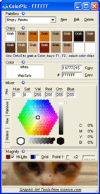
Colorpic
Excellent free web tool to enable you to pick an on-screen colour easily and to the pixel. Colours delivered in hex, decimal, CMYK and save multiple palettes.... Cool
Friday, August 13, 2010
Data visualisation debate featuring David McCandless and Neville Brody
It's good to see a healthy debate about the current trend of 'making data beautiful', especially on mainstream news programmes such as Newsnight. Highlighted here on the Creative review site, the argument says: is data visualisation an aid or hindrance to understanding.

The debate on Newsnight can be seen here and starts at 26:05.
Of course visualisation of data should aid communication, but for me, McCandless advocates the pretty picture road to infographics to the point where we can't tell what the main idea of the graphic is and needs further voice off explanation! I'm happy to report Brody was skeptical of the sorts of graphics McCandless creates and furthermore managed to plug his Anti-Design festival on 18-26.09.10. Something McCandless will no doubt find very unpretty.
Thursday, July 01, 2010
Illustrator and Photoshop Tshirt templates
Needed a Tshirt template for some designs I'm working up and found some cool templates as they show the size of fruit of the loom as well as the standard colours and printable sizes.

Friday, June 25, 2010
Infographics should portray information
I was listening to Radio 4 today and my ears pricked up when I heard they were discussing information design. the programme, More or Less, asked the audience the previous week some questions so that infographic designer David Mcandless could take the data and work on it.


The results are here:
Now I don't deny that what he has done is aesthetically pleasing as I, like him, find data representation or 'information' in its graphic form very interesting. What I find with much of what Mcandless showcases on his blog is that the designers have made the graphics beautiful but have lost some of the impact of the data. Information can be beautiful but I think these designers sometimes work hard to make (or even force) the graphics to be beautiful in a whole different dimension.
Take, for example, the main graphic (What are you doing while listening to More or Less). this graphic seems simple but I find it difficult to pick out more than one or two levels of data. For example I can see where the largest and second largest chunks of activity are but what about fourth, fifth? The 'intensity' label adds more confusion as our eye is drawn to the darker colour and gives it more importance over the others but at the same time biases our analysis. Lying down and handicrafts are the more or less the same size but does handicrafts seem bigger because of the higher contrast?
The merits of this sort of graphic are obvious: a very good snapshot of what people are doing but really I only extract the top four or five and then again with no certainty.
Information design is very important because if style takes precedence over function (that is to say delivering the information to the user in an easily understandable way) then it might as well be a painting of my cat (How many caffe lattes a day does my cat drink? Where does she sit during the day? How little does she care of my existence?).

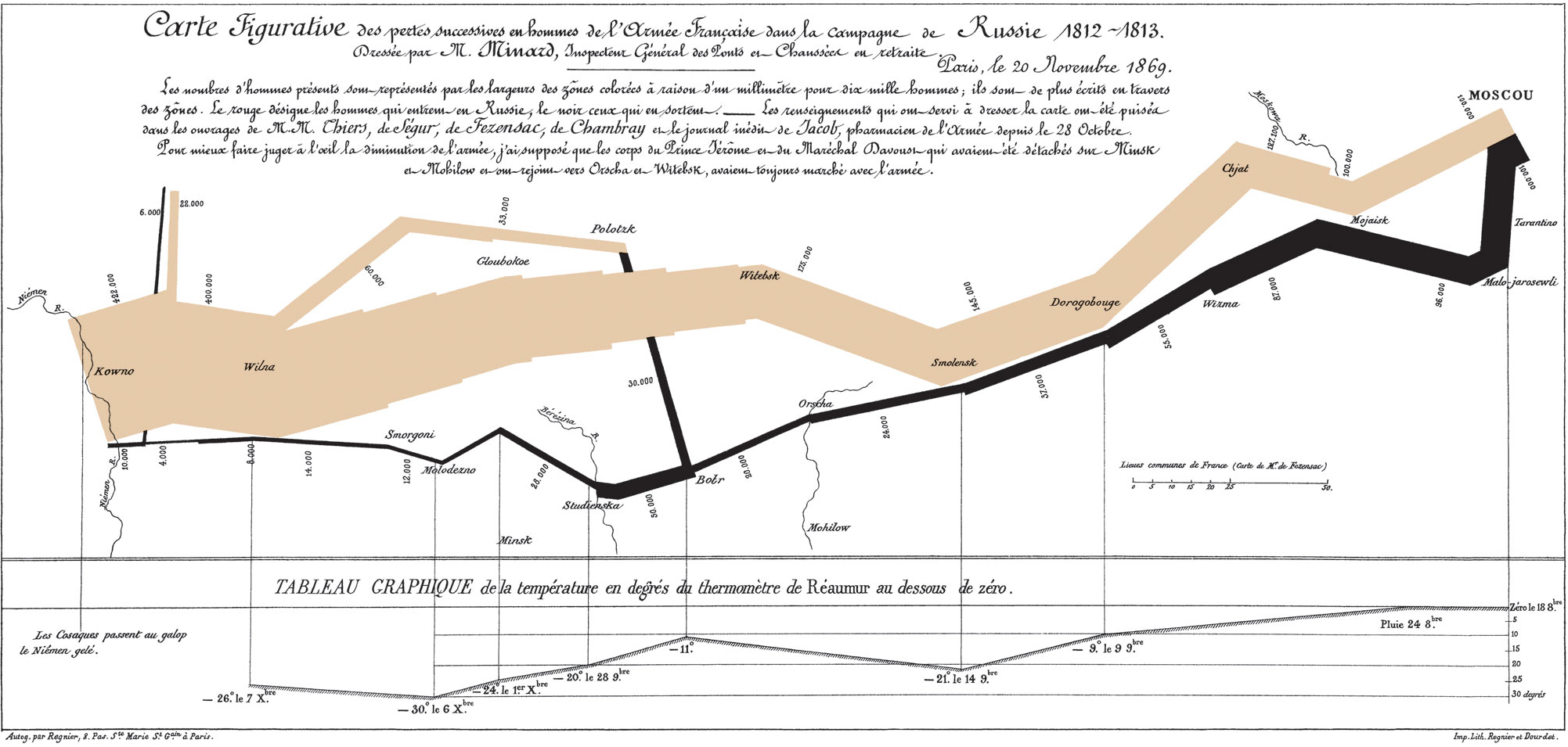
I'd like to end on a well known and pioneering piece of infographics, Charles Minard's graphic showing the decreasing size of the Grande Armée as it marches to Moscow.

Thursday, June 24, 2010
Leading or Line Height in CSS
Top CSS tip for website design idiots like me: leading of text in CS is called line height and can be measured in percentage, as below.
p { line-height: 150% }
Saturday, June 19, 2010
Adding Arrowheads to lines in Illustrator
Being used to Freehand I find this a pain in Illustrator.
And there doesn't seem to be a shortcut...
Choose Effect > Stylize > Add Arrowheads or Filter > Stylize > Add Arrowhead.
Infographics mean what they say don't they?
Ug. Infocrapics more like.

Currently working on a report with lots of data graphs and I needed a break as my brain was exploding. As I googled "infographics" I came across a lot of the very trendy way of portraying data, lots of which leave me fuming. A lot of style is plastered over many of these so that we can't really appreciate what the data is! It really is style over function. When I first started working in design my boss would very kindly guide me away from the garish colours and 3D graphs I would produce for the simple reason that they confuse rather than convey.
So it was with much glee that I found this by Phil Gyford (reproduced under a Creative Commons Licence:

He also makes a good critique of a 'dramatic' graph produced in the FT. Check out his article here.
Interestingly the same boss who steered me away from the 3D graphs and pie charts also instructed me in the techniques Phil talks about in this article: how to make more dramatic fairly plain data, cos guess what...? That's what clients want.
Infocrapics or infographics?
Wednesday, June 16, 2010
Ken Robinson says schools kill creativity
I've been looking at and thinking about design education recently so when I came across a piece on TED about creativity within education I wanted to see more. I'm glad I made time for this witty and informative video and I hope you do too.
Sir Ken Robinson makes an entertaining but powerful argument that the way we educate our children out of creative arts is misguided and sometimes, as he points out in his case study of Gillian Lynne could have been a terribly wasteful mistake.
His follow-up talk about an education 'climate crisis' and the real challenge of transforming education from a 19th century industrial model into a 21st century process based on different principles.
Cambridge University West Cambridge Site
Visiting a client at the West Site of University of Cambridge I was struck by its wide avenue feel, much like a European boulevard. Chatting to the client I asked if he found it a success, to which he replied yes, to an extent. Much of the building there is on a pleasant site, overlooking fields with easy bicycle access and very close to the M11. The contemporary architecture gives a good idea of character: a modern site but with gravitas. The European feel enhanced by a neat coffee shop in the Herman Hauser building. But, he went on, every now and then he's not sure whether it's European Boulevard feel or Posh, sterile industrial estate.


Wednesday, May 26, 2010
Choosing product names
There was a time when cars were called things like Zectrum, Vontra, Shoo, Koop, and so on. Made up names upon which the manufacturers could hang a personality without any baggage from an existing meaning.
Renault has, however, taken an interesting turn and called a car the 'Zoe' which is obviously an existing name. I know a Zoe or two. Not sure how they'd feel about having a car name. One such real life Zoe Renault is certainly not pleased and has asked the manufacturer Renault to withdraw the name or face being sued. BBC article here.
Zoe Renault says, "I could not bear to hear: 'Zoe's broken down' or 'We need to get Zoe overhauled'." Amazingly her lawyer, David Koubbi, specialises in the protection of first names!
Maybe he should be called a personal branding lawyer. In France the name you choose for your child has to be vetted and a famous case over the last ten or so years came to light when some parents wanted to call their child Peripherique Nord because the mother's waters broke there. Trouble is this means Northern Ringroad and cause a bit of a stir in France.
Reuters reported of a couple who wanted to name their child Friday (the day the boy was born) but a court ruled against this (despite it having been baptised) and ordered it to be called Gregory. Read about it here.
"I am livid about this, a court should not waste its time with things like this when there is so much more to worry about."
"My son was born Friday, baptized Friday, will call himself Friday, we will call him Friday but when he gets older he will have to sign his name Gregory."
Subscribe to:
Posts (Atom)