Tuesday, February 08, 2011

A huge list of Style Guides and UI Guidelines » The UX Bookmark

A huge list of Style Guides and UI Guidelines » The UX Bookmark

Interesting to see companies' guidelines and there are plenty to choose from here.

See how they protect their logo...!

Thanks to http://www.behance.net/analia_antenucci for spotting this.

Friday, February 04, 2011

***Top 5 design objects of all time***

1.Supermarine Spitfire

The Supermarine Spitfire was designed in the thirties as a seaplane and retained some of this art deco style and elegance despite it turning into one of the msot effective killing machines in the second world war.

This paradox is intriguing to me and shows a complete mix of form and function. The stylish eliptical wings and bubble 'Malcolm' style canopy were introduced for functional reasons but boy, this plane looks sweet and, by all accounts, handled like a dream.

So much so that German pilots who were shot down by other Allied aircraft swore blind that it was a Spitfire that shot them down.

Spitfire snobbery, and rightly so.


2. Marcel Breuer's B32 Chair
Embracing modern production techniques without foregoing style, the B32 chair cleverly strips down the infrastructure of the chair to its most basic construction but looks great. In addition it is, unlike Mies van der Rohe's Barcelona chair, comfortable to sit in!


3. Cat's eyes (road safety reflective devices)
The cat's eyes follow you everywhere, never ceasing to cast their gaze over your travels. And it's a caring gaze as these cat's eyes, embedded into the roads all over the UK help driver's perceive the route ahead by clever use of reflective lenses. But that's not the only clever part: housed in rubber domes they are wiped clean whenever a car goes over them and pushes down the dome.

Ingenious, simple, low-cost and, in today's *environment*, very friendly.


4. Tube map (Harry Beck)
I appreciate that I'm stretching the bounds of 'object' here, but let's just say the tube map, as a poster, is not only essential for travelling in London it's also an inspired and (to me) beautiful piece of sculpted infographics. Up to the point Beck introduced his version in 1931 the map had been based on geographic lines but with the increasing complexity of the Underground system something had to be done. Beck's saw the solution as helping people get around more effectively.

Although the map has undergone many revisions since the thirties it still retains Beck's distinctive style and effectiveness.


5. Post-its!
Simple, effective and borne out of a search for a gap in the market for *slightly* sticky glue. This product shows how with good research and a red hot research department victory can be snatched from the jaws of adversity (initially it was a consumer flop). And what a victory!

Post-its! not only help us bookmark, send notes and make shopping lists they also help us brainstorm new products. The ideal product designer's choice.


Tuesday, February 01, 2011

Is Google taking over the world? Probably.

Neat advert for Google animation (technically a viral advertising campaign, "Google Demo Slam" was a competition run by google to encourage people to create youtube videos promoting Google applications.)

Is Google docs taking over your office?


Monday, January 17, 2011

Using the Golden Ratio to boost sales

As part of my research into the psychology of design I've borrowed a book from the library (actually lots of books, but the one I'm looking at currently is) 'Guerilla Marketing Revolution', Levinson, J.C., Hanley, P. R. J., 2006.

One part of their book examines the Golden Ratio (1:1.618) which has been used throughout art and design history to render artworks more pleasing on the eye. Levinson and Hanley take this step even further by stating that design which is based on the golden ratio is so pleasing on the eye that "materials which used the golden ratio performed five or six times better than those that did not" (p.80).

Furthermore they find that it improves readability and data retention but they state that the horizontal ratio has the only benefit in sales and marketing literature while vertical lines can be used in website design.

I also always use a Golden Ratio grid on business card layouts.


Friday, January 14, 2011

How graphic design affects the buying decision

I've been thinking a lot about this recently and yesterday's meeting and vibrant discussion with a colleague only fuelled this debate further for me. It's easy to see how the buying decision can be swayed by graphic design on a superficial level: only yesterday in the supermarket one of my children stopped in front of the washing detergent aisle and mentioned that one particular brand looked great, "This one's the best!". I asked why to which I was told that it was prettier with nicer illustrations on it. So it works on a basic level: shape of packaging, design of on package graphics. Maybe this can be further pushed to is the packaging innovative and will it enhance my experience of using the product. Mostly, though, I find similar products perform a similar function. Supermarket own brand might not smell as nice as other brands, or may not clean 'as deeply' but essentially it cleans clothes. I'm not saying that product characteristics don't count for anything in the buying process, rather that the initial on shelf experience of the average shopper is dictated by graphic design. (I'm discounting for the moment brand experience built by other channels before this buy-decision).

This is where I'm putting effort into thinking at the moment. Our eyes see the packaging and our brains decode the information and produce a buy/don't buy decision. Why? What occupies this space between design and decision? Gladwell (Blink, Gladwell, M. 2005 ) talks about a consulting firm which helped make a brand of spirits number one seller based on tweaking the packaging shape alone. He also states that not only the shape and colour of the packaging made customers prefer one product over the other but very subtle variances in the design of the label. And the thing is, the product didn't change! It was just the same as before when it was in second place in the sales chart but now the customer perceives it to be better.

So I'm setting off on a deep journey into the world of Design Theory and its affect on the buying decision. Where will it lead me? Through typography, sociology, psychology no doubt, even maybe early human history. Feel free to join the journey with me...

Next stop: Think!: Why Crucial Decisions Can’t Be Made in the Blink of an Eye (Simon and Schuster, 2006)


Thursday, January 13, 2011

15 UI Design Patterns Web Designers Should Keep Handy

A link over to an article covering the key areas of a website design. Overview of layout, functionality, usability and plenty of further reading links. Well done @!


(In this case 'patterns' refers to trends not textures)

Brochure design for University of Cambridge (IFM)

Thursday, January 06, 2011

Starbucks-the evolution of brand

Starbucks is evolving its brand and has come up with a new logo. This reflects the businesses ongoing efforts to branch out into other sectors and its desire to be not chained to the idea of coffee alone.

Is this a perfectly reasonable evolution or is it crazy to think of Starbucks selling anything other than coffee products? Well this is why they are tweaking the logo to prepare customers and open the brand up. Check out the BBC article here.

A previous incarnation of the Starbucks logo brought flack from different quarters in the past...:

Friday, December 17, 2010

A vehicle has a face-Tron car design with Daniel Simon

Daniel Simon talking about how the form of the Tron: Legacy cars came about. Before designing cars for Tron Simon was a concept car designer for VW. On his site he says, "None of my designs will ever hit the road...most of them disappear into cellars, never to be seen".

Fear not Mr Simon, your vehicles are now hitting the big screen....


Google image results for "Daniel Simon":

Thursday, December 16, 2010

Oscar Niemeyer still working at 103

Oscar Niemeyer opened a museum of his work today. This centenarian architect from Brazil is well known for his own style of modern architecture which he termed 'Ionic'.

The following is the result page of an image search of Niemeyer's name:


Article about his museum:


Wednesday, December 15, 2010

Friday, December 10, 2010

Uphype

The place for smart people to share the
things they'll do to hype your stuff.

All for only $8, $16 or $24

The Art of Wireframes

Everything you wanted to know about wireframing but were afraid to ask...

Thursday, December 02, 2010

Chas Sims and TTP: The Traditional and Untraditional.

Chas Sims and TTP: The Traditional and Untraditional.

Nokia Facebook page

I really like this vibrant, info-packed Facebook page. Nice piece of graphic design, I think. Looks like a cool classified page for Nokia products only. There's good contrast in the first advert which gives focus, then lighter toned ads surrounding to ease the eye around the page. You could see this is a wall of information; a big block of data. But my eyes don't feel like they're heavily lunking around the page. The parcels of ideas are packaged nicely for me to pick apart what I need.


Plus I love this border edge/background combo here:

Border: D4D6D5, Background: DEDEDE. (Thanks to the colorpic tool)

Embedded video/audio player

Here's a neat bit of open source technology (JW Player) enabling you to embed audio or video into a website. Plus it gives you plenty of opportunity to skin it and change colours to your heart's desire.

Here it is in action on the Trinity College Choir site


Wednesday, September 15, 2010

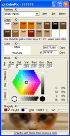
Colorpic

Excellent free web tool to enable you to pick an on-screen colour easily and to the pixel. Colours delivered in hex, decimal, CMYK and save multiple palettes.... Cool


Friday, August 13, 2010

Data visualisation debate featuring David McCandless and Neville Brody

It's good to see a healthy debate about the current trend of 'making data beautiful', especially on mainstream news programmes such as Newsnight. Highlighted here on the Creative review site, the argument says: is data visualisation an aid or hindrance to understanding.

The debate on Newsnight can be seen here and starts at 26:05.

Of course visualisation of data should aid communication, but for me, McCandless advocates the pretty picture road to infographics to the point where we can't tell what the main idea of the graphic is and needs further voice off explanation! I'm happy to report Brody was skeptical of the sorts of graphics McCandless creates and furthermore managed to plug his Anti-Design festival on 18-26.09.10. Something McCandless will no doubt find very unpretty.

More rants on infocrapics here, and here.


Thursday, July 01, 2010

Illustrator and Photoshop Tshirt templates

Needed a Tshirt template for some designs I'm working up and found some cool templates as they show the size of fruit of the loom as well as the standard colours and printable sizes.