Monday, December 31, 2012

The Success Factor

Good points for everybody to take on board as we embark on a New Year…
http://www.huffingtonpost.com/maryellen-tribby/the-success-indicator_b_1874431.html

The Success Factor Indicator
Successful People
Have a sense of gratitude
Forgive others
Accept responsibility for their failures
Compliment
Read everyday
Keep a journal
Talk about ideas
Want others to succeed
Share information and data
Keep a "to-be" list
Exude joy
Keep a "to-do/project" list
Set goals and develop life plans
Embrace change
Give other people credit for their victories
Operate from a transformational perspective
Unsuccessful People
Have a sense of entitlement
Hold a grudge
Blame others for their failures
Criticize
Watch TV everyday
Say they keep a journal but really don't
Talk about people
Secretly hope others fail
Horde information and data
Don't know what they want to be
Exude anger
Fly by their seat of their pants
Never set goals
Think they know it all
Fear change
Take all the credit of their victories
Operate from a transactional perspective

Sunday, December 16, 2012

Online searching in real life

Neat Google Analytics ad pretty much sums up the feeling you sometimes get when online searching.
Milk, semi-skimmed.

It doesn't have to be this way though does it!?


Friday, December 07, 2012

How to get people to do what you want

This is a great video by Associate Professor Charles Dwyer who has a quirky and funny delivery. I'm pleased I found this video as it reaffirms some of the thoughts I had about working with others.

"People do what they do to take care of what's important for them"…


- It's all your responsibility! 100%
- Positive reinforcement and influence
- There's no place for ego:people will do it for *their* reasons
- The stuff of human influence is fluff: timing, words, tone…
- Reasons with "because" increases the likelihood of your demand being followed through
- Ask for help from others
- Thank people
- Communication breakdowns are your fault, "I must not have said that very well, let me try that again…"

McCabe's Law: "McCabe's Law: Nobody _has_ to do _anything_."


Sunday, December 02, 2012

Old Skool UI

As our car was in for a service I had the opportunity of using the new Scenic for a while and was interested by the dashboard UI. The most interesting thing I noticed was that the fuel gauge was old skool! The display was fully animated and this fuel indicator was in fact a facsimile of the way analogue fuel used to appear. I'm sure this is the result of much user feedback and not the whim of a misty-eyed older designer (ahem). 

In addition the rev counter was a sliding arched scale much like you'd see in a video game and the speedometer was a digit. Have video games influenced dashboard UI? Car games dashboards have long needed to be animated and this sort of animation is commonplace in the virtual world. Have we been so influenced by games that we *need* similar UI in our real cars?

Is this life imitating [c]art?


Friday, November 23, 2012

Visual language for design


Chief Mazda car designer, Akira Tamatani, talks about the visual language used in the new Mazda 6 car design. Enlightening stuff, regardless of the fact it seems tightly scripted by the marketing department. Tamatani says he was inspired by the power and beauty of the horse in the design of this car. Judge for yourself.


Thursday, November 15, 2012

First 3D measurement chip developed to make mobile gestural interaction possible

Following on from my sci-fi inspired gestural interface post, I'm following up with a bit of good news concerning the development of technology that may well soon make this into a reality.

As well as the camera-based technology developed by others such as Leap based on camera technology there are advances in electrical field controlling for mobile devices too.

Overview of Leap's technology


Microchip Technology are now launching chips which help mobile devices sense movements in 3D using this electrical field technology. With an active area of only 6 inches though, this is somewhat limited. One can envisage applications in controlling mobile devices which may not need more than that distance for effective interface. Check out Mashable's article about the new chip release.

A general, corporate video from the technology developer, Ident Technology AG.


Here is the technology developer's website, Ident-Technology.

Gesture control


Tuesday, November 13, 2012

Minority report User Interface (sign language for your computer)


I thought Minority Report was a great film. It's my kind of science fiction: thoughtful and set not too far in the future nor based solely on whacky gadgets that we think may one day come into existence. The technological developments which we see in Minority Report are close enough to feel achievable, such as the following interface between John and the digital files he's inspecting.


Imagine my surprise when visiting the Maritime museum in Cherbourg (Cité de la mer) when I get to have a play with such an interface! It was a little cranky as it took a bit of work to stay still enough within the active zone but it was perfectly usable.

Plink, plink...
Not like that Daddy, like this!


Furthermore when checking out more of these types of interfaces online I see that there are some amazing new advancements with gestural recognition and I have included a video of 'kinect' below controlling Windows 7.


The real impact of this technology will come when the interface can be controlled with very subtle gestures rather than the big pointy and hovering movements we see in the video. The above video demonstrates a useful application of current gestural recognition but I see this developing more into a discreet sign language. It will become less of a series of large gestures you need to learn (much like apple track pad and mouse interfaces) and more akin to a sign language you'll need to take up in order to communicate with your computer. This will enable you to have much more freedom and depth of communication.

Once these gestures become so small and well defined and set into a language 'structure' then we will see the mouse becoming redundant.

Friday, November 09, 2012

Tablet interface difficult for creating artwork but good for sketching

Tablets are great aren't they? Portable, shiny and lovely. But are they any good at content creation? This BBCnews article (Creating art on tablets remains a work in progress) outlines the pitfalls of creating art on an ipad or tablet and reflects my frustration at illustrating directly onto the tablet screen.

I found that sketching wasn't a problem and indeed some apps enhance the dynamic feel by but trying to get anything close to what you intend takes some working out. Then again most media aren't that immediate; it takes time to learn how to manipulate images, textures and colours be it a new type of painting process or an illustration software. I suppose this is the crux of the painting on a tablet is difficult problem: we expect it to be easy because of the interface. But the friction on the tablet and the absence of any pressure sensitivity means you have to work at it to get results. Having said that plenty of people have! Including, of course, the most famous exponent of tablet art, Mr. Hockney.

Belgian Design at Atomium: Something for the weekend?

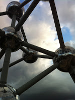
Intersections 2 Exhibition at the Atomium, Brussels.

AtomiumDespite being hugely into design I'm not usually a great fan of design exhibitions. Such shows can be a parade of the pretty where they present design as being that which is only involved in the aesthetic or to use a phrase clients have used to me in the past: "tarts things up a bit". (If you're an industrial designer you may have heard the term, "to paint it yellow"…!)

The Intersections 2 Exhibition at the Atomium in Brussels, however, shows a real kind of design. Thoughtful and useful design. Design that affects people's lives in a positive way and leaves them better off after the interaction. That's what design is for me. Sometimes I think of design as more of a thought process than an illustration process (which I probably did when I was younger).


The show highlights three Belgian companies with an emphasis on 3D work from across the spectrum. Achilles Design is a product, brand and service agency in Mechelen, Lucile Soufflet showed some interesting public furniture work and Diane Steverlynck's work focuses on "materials and structures and their influence on the use and identity of everyday objects".


Achilles Design, Lucile Soufflet, Diane Steverlynck

And what better way to finish off an evening celebrating great Belgian institutions than with a great Belgian institution of fritjes, bier en balletjes (Frituur Charles)..


Monday, October 01, 2012

Buffer : handling sharing on social media.

Found this neat free app for sharing on social media. The problem with propagating stories is that you have to have a good stock of them lined up and be able to schedule them at the right time otherwise the effect is somewhat lost. Bufferapp is able to stock up a 'buffer' of stories you find whenever you are browsing throughout the day and then publish them at your specified times.

Optimal tweets per day? See this article. Just add them to the buffer, set the times you want and you're off.

Link in multiple accounts or Facebook pages that you manage. Very good so far.


Thursday, September 27, 2012

New tech roundup from the BBC


Silicon Valley's hottest start-ups vie for attention


California's Silicon Valley has done much to earn its reputation as the world's leading technology hub.
This article covers new tech start-up products the self-balancing motorbike, the anticipatory chat app and the $10,000 coffee machine. Are these guys on the right track? Check out the article here: http://www.bbc.com/news/technology-19655627

Monday, July 23, 2012

Samsung buys CSR mobile

http://www.bbc.co.uk/news/uk-england-cambridgeshire-18908035

and such a BEAUTIFULLY designed logo too! That must have swung it for Samsung, surely….

Thursday, July 19, 2012

Mirror Neurons help us empathise, teach, inform

Another interesting article to from Ramachandran and here he talks about what he calls 'mirror neurons'. This talk reveals some insights into how we can teach, inform, empathise or care for others better.

Humanities meets Science.


Tuesday, July 17, 2012

Evolution, the eye and communication design

Whilst on holiday (this fact is not superfluous, it crops up later!) I finished reading Richard Dawkin's fascinating and insightful book, "The Greatest Show on Earth" which outlined the evidence for evolution.

Dawkins says that the eye is an amazing, if oddly put together piece of kit and he uses this as an argument against an 'intelligent creator'. He points out that the optic nerve gobbles up quite a lot of important retinal real estate and would most likely not be made in such a way by an intelligent designer of an eye. Amazingly, however, we don't perceive this 'hole' nor do we generally see the gap between our eyes as our brains do an amazing job of working out the 'puzzle' in front of us and rendering us pretty seamless vision. I am aware of this more than most as my wife suffers from a condition which has caused her to lose some sight near her macula but, as her consultant tells her, the brain does an amazing job of compensating and under normal circumstances she sees no 'gap', despite the disease's progress.

I was first put on to the amazing visual processing power of the brain after listening to the 2003 Reith lectures called 'The Emerging Mind' given by Vilayanur S. Ramachandran. He details the workings of the mind and notably touches on art: "Are there such things as artistic universals?", he asks.

The lecture is well worth a listen but one point I want to dwell on here which struck a chord with me after my holiday at the coast (aha!) was the story about the seagulls. On holiday I saw plenty of seagulls and I love to hear them 'squaaaaaww'. As they fly past I often point out the red spot under the beak to my children and tell them the following story.

Experiments on seagull chicks by N. Tinbergen at Oxford University showed that this spot is not only a very important signal for the chick to peck at for food, but by abstracting it further researchers found that a chick would peck for food at a red spot painted on two two long sticks!

Photo (taken on holiday!) by PG.

Furthermore, Tinbergen found out that the higher the contrast of the red spot the more the chick will peck for food and this high contrast is what the chick perceives as 'motherness'. Ramachandran emphasises that this is intellignet rationalisation of the brain processing of a chick: the goal of vision, he points out, is to do as little as is needed to get the job done. Evolution has taught the chick that all it needs to do is peck at the high contrast red spot in order to be fed, because this is 'mother'. It cares not that the mother has a head, wings, feathers or legs because it's saving energy! The red spot will do.

The analogy I see with interface design is clear: we need to use visual clues and the processing power of humans' brains to streamline our interaction design and icon development. Use what is hard-wired within us all to make that interactive process a seamless one for the user so that they are helped along the process by the mother within them. Why use complex invented icons when our innate feelings can show us a simpler way. We don't however need the blatancy of red panic buttons for simpler operations (although occasionally this might help!). We can do better than this with more subtle colour palettes, intelligent photographic choices and visual clues in order to smooth the passage from operation to operation.

So designers: before you use your pencils, use your brains.


Thursday, June 28, 2012

Essential dos of the Corporate Tweet

Following a study of some of the world's "biggest brands" a new study by Buddy Media has examined brand tweets from Dec. 11, 2011 to Feb. 23, 201 and revealed some essential dos of the corporate tweet.


- Tweet over the weekend
Twitter engagement rates for brands are 17% higher on Saturday and Sunday
- Tweets over the weekend should be between 8 am and 7 pm
The study shows tweets between these times have 30% higher engagement rates
- 4 tweets a day is optimal
More than this and you start getting diminishing returns
- Include a link
Linked tweets have an 86% higher retweet rate than tweets without links.
- Use hashtags (up to two)
Tweets with hashtags get twice the engagement of those without
Using one or even two hashtags in a tweet is fine, but if you add a third, you’ll begin to see an average 17% dropoff in engagement.

- Add an image
Posts with images have double the engagement of those without
- Ask followers to 'retweet'.
Asking followers to “RT,” will give 12X higher retweet rate than not. Using the word “retweet,” makes that rate jumps 23X.


Full article here: http://mashable.com/2012/06/26/marketers-failing-twitter-study/

Wednesday, June 27, 2012

Scientific Creativity

Insightful TED talk by a surgeon who examines creativity, particularly musical creativity, through science.

Expressive communication and the language of expressive music.

"It's magical but it's not magic"

Curious? Watch this neat outline of Charles Limb's study of 'scientific creativity' and innovation in the arts.


Sunday, June 10, 2012

The (Negative) Power of Social Media

Or, "there is such thing as bad publicity".

Just a quick comment on this hilariously cheesy and somewhat off-colour video which left Microsoft more than a little red in the face. It's an example of how social media can take over your event and trend in ways you just didn't think were possible!

I *particularly* enjoy the line in the song:
"I'm a software developer, I'm developing, And I'm here to party…"

But the really embarrassing lyric was yet to come…
The rap manages to proclaim, “The words MICRO and SOFT don’t apply to my penis.”

And of course this was tweeted immediately forcing Microsoft's Head of Communications to apologise.

Lessons for us all, I think…


Link/full story: http://pulse.me/s/a7MWC 

Thursday, May 31, 2012

Attack Marketing and Social Media

Great story here that really highlights something I've been thinking of recently: using social media appropriately. Vibram, the funky shoe manufacturer, had been inundated with complaints from customers who thought they had bought genuine products only to find them quickly fall apart! Vibram soon realised that although the returned products looked like Vibram shoes they just weren't right.


After much thought Vibram decided not to wait for government help against counterfeiters but to act themselves. How?


"Candidly, you have to realise that intellectual property only gets you so far," says CEO Tony Post. "At the end of the day it's really about your relationship with the consumer."


They seem to have pulled off an amazing turnaround and in some part it's due to social media. But not only social media.


When I saw this graphic showing the complexity of social media tools I threw my hands up in the air. This graphic seemed to say that marketing is complex now. But it doesn't have to be. These are just tools you could use in order to better your relationship with your customer (as Vibram's CEO says). 


Marketing isn't about facebook, or LinkedIn or twitter (alone). It's about people. Sure these are tools that can reach your key stakeholders but honestly: would you use EVERY gardening tool you had to plant a seed? 


Just as Vibram did, you have to choose when to use social media and how to apply it to your goals. And of course, which tools will best reach your stakeholders.

Friday, March 09, 2012

David Hockney pushes boundaries of art creation

It's wonderful to see an established artist tinkering at the edges of technology to create their art. David Hockney's ipad exhibition shows off his ipad created 'paintings' and talks intelligently about how he feels that throughout art history embracing new media has always been the case.

The following video shows a different exhibition in Canada, still by Hockney, but this time using screens to display the artwork which calls for a different appreciation. The gallery is dark and the artwork is lit and as Hockney says offers a different "luminosity" to the work.


Here's the ROM's Hockney exhibition link: http://www.rom.on.ca/hockney/

After seeing this series of videos I wondered what the technology was like and what level of detail it could actually achieve. Here is a painting by a different artist showing a high level of detail using the 'Brushes' app


In addition there's a whole suite of brushes and stylus pens to use with this sort of program:
http://thenextweb.com/apple/2011/02/26/5-stylus-pens-and-brushes-perfect-for-ipad-artists/

I need to get painting again. Now, though, with light!


Monday, February 06, 2012

Find Your Own Voice: Working with Lucian Freud

Lovely slideshow by the BBC about art and life with Lucian Freud.
"He wanted you to find your own voice, and that's what you have to do as an artist."

http://www.bbc.co.uk/news/entertainment-arts-16849079

Friday, February 03, 2012

Science meets art

In another post relating to visualisation in the sciences check out some interesting visual projects based on better understanding aspects of science. This is Visualization Challenge sponsored by science magazine is run to, "promote cutting-edge efforts to visualize scientific data, principles, and ideas" The challenge covered different media: Photography, Illustration, Informational Posters and Graphics, Interactive games and videos.


Check out some of the resulting entrants in a slideshow here on the BBC website.


Following is an 'Honorable Mention' in the Video section. A nice blend of video, graphics and music to give an entertaining and, more importantly, an informative presentation.


Monday, January 23, 2012

Animating Science

How do we communicate ideas of cells that are "smaller than the wavelength of light".

Good question.


Visually communicating these concepts must be a real challenge as it needs to show what is happening in 3 dimensions at molecular level of things we understand, but can't actually see. This video shows neatly how scientists can use drawing, illustration and animation as part of their thinking process. I find that this is where real design communication comes into its own. Design and illustration has always been fundamental to a process of thinking and not 'showing off'. Of course we need to show our thinking and that's where the presentation of our thinking turns into animations or infographics.

Unfortunately many infographics (or infocrapics) get lost in the delivery of their own beauty rather than using relevant information to make clear by way of an illustration. These infographics aren't used to work out complex ideas into simpler, more easier to understand graphics, rather they use information to force an outcome which is purely attractive without substance.

Take for example the following:
http://www.informationisbeautiful.net/2012/top-21-albums-of-2011/

In an effort to make the Top 21 Albums of 2011 more visually attractive the 'designer' has used different sizes of the name of the album to relate how popular it is. In addition they have used different fonts to differentiate the albums. The trouble is that the names of these albums are of different length so this skews completely the weighting given to each name by increasing its size! Why do this instead of producing a list or a simple bar chart? The creator hasn't used this as a thinking aid or a communication aid rather as a source of self gratification. Amazingly the 'designer' quotes the original source which is a simple list, not much larger in size than the infographic, but which gives more information…

Let's think about how we communicate and communicate what we think.